KIMMY’S
SPACE DESIGN / FOOD QSR DESIGN
Noticed how most coffee shops feel familiar? We did too. Walk into most coffee shops today and it’s like déjà vu—muted palettes, minimalistic furniture, Edison bulbs, and the same safe vibe. Why does aesthetic now mostly mean beige or pastels? Why do we keep playing it safe with design in spaces that are meant to energize and inspire?
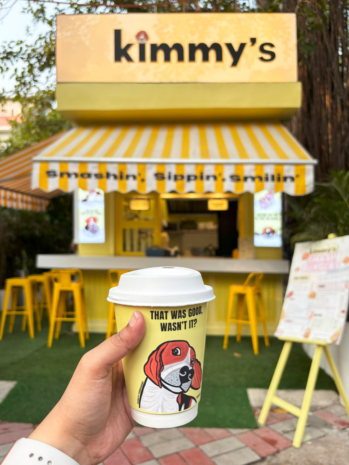
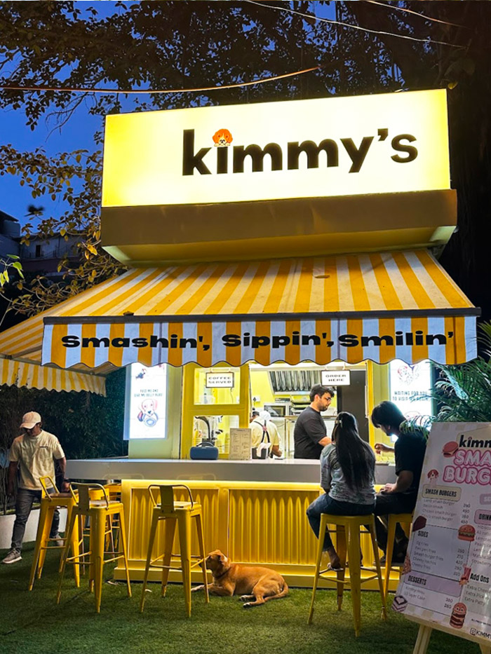
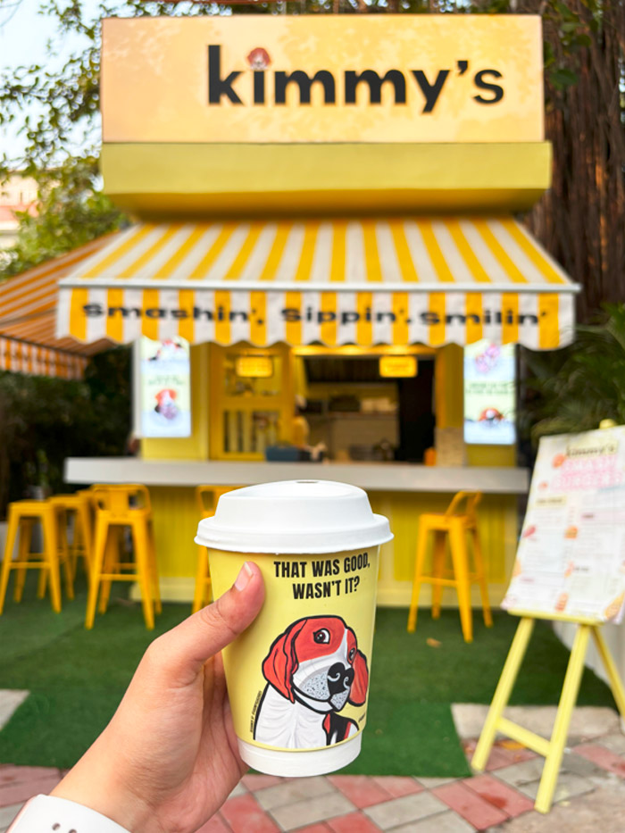
While designing the space for Kimmy’s in Delhi, we decided to flip the script. Picture this: a vibrant, unapologetically yellow café that turns heads, serves coffee and desserts and doubles as a smash burger joint by night. Designed to be instantly recognizable, Kimmy’s is not just another coffee shop—it’s a landmark in the making.
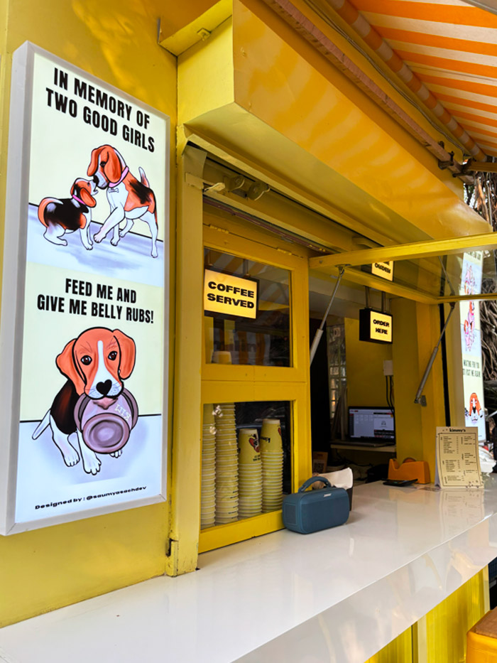
The concept is as layered as the space itself. Inspired by two beloved beagles (yes, real dogs!), Kimmy’s is a tribute wrapped in nostalgia, joy, and delicious duality. So, we went all in on a bold, yellow—cheerful, vibrant, and impossible to ignore. Not just for shock value, but to create a true brand identity. Something people would remember, spot from down the street, and associate instantly with the brand. The space is designed to tell a simple story—through colour, play of materials and graphics with the full functionality of a F&B Quick Service Restaurant.
Design, to me, isn’t just about what looks good. It’s about what tells a story and creates connection. Let me know your thoughts. And if you’re in Delhi, do stop by and say hi to Kimmy’s. Just follow the yellow.
Get started with a consultation today
Please share your details to start something new together.
